• Veröffentlicht am

Best in Show bei Aedra Fine Arts: Kurator Michael Hanna begutachtet meine Arbeit

Up North geometric abstract mountain painting by Shilo Ratner

Ich freue mich riesig bekannt zu geben, dass meine Arbeit als „Best in Show“ bei der Aedra Fine Arts Fortune Favors Exhibition ausgewählt wurde, begleitet von einer aufschlussreichen kritischen Rezension des Kurators Michael Hanna.

Eine persönliche Reflexion über die Reise des Künstlers

Ich möchte der kritischen Rezension von Michael Hanna eine persönliche Reflexion voranstellen. Die Reise des Künstlers ist oft eine einsame, die sich in der Abgeschiedenheit eines Ateliers entfaltet. Selbst inmitten einer lebendigen Gemeinschaft von Künstlern, Sammlern und Bewunderern gibt es ein inhärentes Gefühl der Isolation – ein Paradoxon aus Verbindung und Distanz, das im Stillen schafft.

In dieser Einsamkeit geschieht die wahre Magie. Hier ringen wir mit unseren tiefsten Ängsten, vergangenen Traumata, Hoffnungen und allem dazwischen. Hier finden wir Trost, Stärke und unsere Stimme. Aber es ist auch ein Ort der Verletzlichkeit, an dem wir unsere rohen, ungefilterten Gedanken und unerfüllten Träume offenlegen.

Inmitten dieser komplexen Landschaft kann eine nachdenkliche Rezension einen besonders verletzlichen Punkt treffen. Wenn eine solche Rezension erscheint, ist sie wie ein Lichtstrahl in der Dunkelheit – eine Anerkennung des einsamen Kampfes, der unzähligen Stunden, die man alleine verbracht hat, der Opfer, die gebracht wurden, und der Risiken, die eingegangen wurden. Es ist eine Bestätigung der einzigartigen Vision, ein Beweis für die Kraft der Kreativität und eine Erinnerung daran, dass die Reise, obwohl oft einsam, nicht ohne Verständnis ist.

„Best in Show“ bei Aedra Fine Arts

Ich fühle mich geehrt bekannt zu geben, dass meine Arbeit als „Best in Show“ bei der Aedra Fine Arts Fortune Favors Exhibition ausgewählt wurde. Ein gebundener Katalog dieser Ausstellung wird später in diesem Jahr veröffentlicht – eine bleibende Aufzeichnung dieser unglaublichen Ehre.

Sechsundzwanzig Künstler aus aller Welt wurden für diese internationale Jury-Ausstellung ausgewählt, die Sie hier einsehen können: Fortune Favors Exhibition. Neben so talentierten zeitgenössischen Künstlern ausgestellt zu werden, ist sowohl demütigend als auch inspirierend.

Die untenstehende aufschlussreiche Rezension von Kurator Michael Hanna hat mich zutiefst bewegt. Sein Verständnis der Arbeit und seine Artikulation ihrer Qualitäten zeigen die Art von durchdachter Kritik, die sich jeder Künstler erhofft.

Kritische Rezension von Kurator Michael Hanna

When Morning Calls geometric abstract painting by Shilo Ratner

Shilo Ratner ist eine geometrische Malerin, die in den Vereinigten Staaten und insbesondere in Connecticut ausgestellt hat. Sie wird von der Bryant Street Gallery in Palo Alto, Kalifornien, der Candita Clay Gallery in New London, New Hampshire, Claire Carino Contemporary in Boston, der Jen Tough Gallery in Santa Fe, der MIKA Gallery in Tel Aviv und GALLERyLabs in Buenos Aires und New Haven vertreten.

Shilos Gemälde wurden in mehreren Museen in den Vereinigten Staaten ausgestellt, darunter zuletzt im Museum of Contemporary Art in Marin, Kalifornien, im Mystic Museum of Art an der Connecticut Academy of Fine Arts und im Marietta Cobb Museum of Art in Georgia. Zu den bemerkenswerten Veröffentlichungen gehören Beiträge im Studio Visit Magazine, Daily Nutmeg und The Daily Connecticut.

Pool House geometric abstract painting by Shilo Ratner

Geometrische Abstraktion und optische Täuschungen

Scharf und mit kontrollierten Kompositionen zerlegen Shilos Gemälde Sujets wie Landschaften und Architektur in kantige dreieckige Formen und Fragmente, die sich aneinanderfügen. Mit hohem Kontrast zwischen dunklen und hellen Farben stellen die Gemälde kollektiv eine verzerrte Welt optischer Täuschungen dar, die sich auf der Horizontlinie erstreckt.

Typischerweise zeigen die Werke kühle Berggipfel oder Ferienhäuser und zerlegen die Dreidimensionalität durch geometrische Neigung in Flächigkeit. Der schiere Designwert solcher Werke bietet eine ruhige, klare und saubere Oberfläche, die Formen wie Schatten und Reflexionen im Wasser zu monochromen Formen poliert.

Shilos Gemälde enthalten typischerweise asymmetrische Schrägen, die auf der akzentuierten Horizontlinie ruhen und kräftige Pastell- und helle Töne enthalten. Mit klarer Teilung erscheinen die Formen, ähnlich einem Puzzle, fragmentiert in Einzelteilen, sind aber durch eine harmonische Komposition, die auf den ebenen Flächen ruht, ganzheitlich miteinander verbunden.

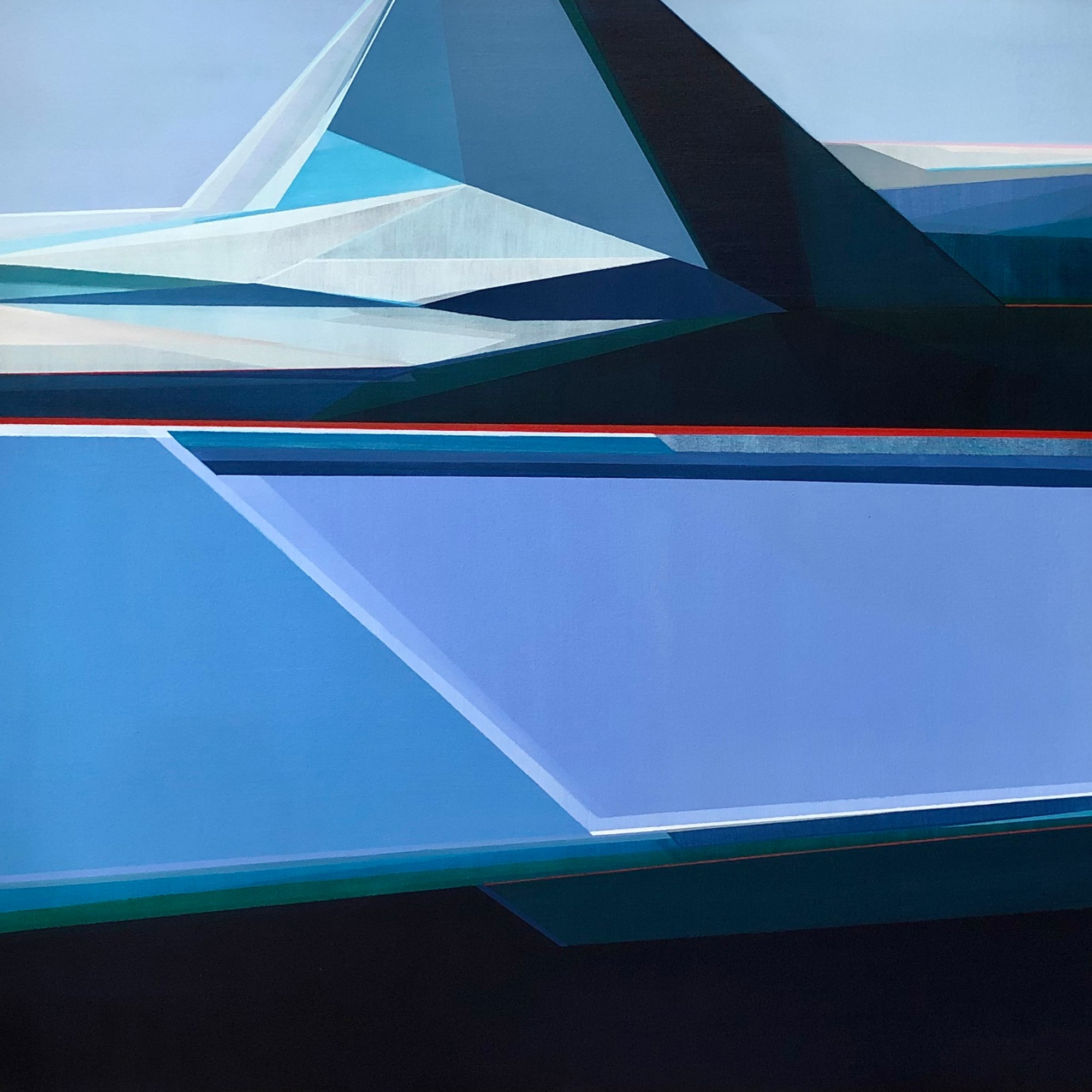
Sunrise Mountain: Eckige Ästhetik

Sunrise Mountain geometric abstract painting by Shilo Ratner

Sunrise Mountain (oben abgebildet) bleibt eines von Shilos erfrischendsten Werken in der puren Pracht der kantigen Ästhetik. Mit subtilen Variationen von Blau, die von Preußisch, Azurblau und Türkis reichen, ergießt sich der zerklüftete Berg auf die flache Wasseroberfläche mit komplexen Formen von Reflexionen aus Lichtern und Schatten in Form von gestreckten Dreiecken und Rechtecken unterschiedlicher Töne. Das Sonnenlicht wird durch einen minimalistischen Ansatz von nur drei Streifen kantiger Farbe im unteren Vordergrund dargestellt, als ob es den Morgentau anzeigen würde.

Eine poetische Malerin

Shilo Ratner kann als poetische Malerin beschrieben werden, die eine kühle, polierte Herangehensweise an Verzerrungen in der Malerei durch kantige Schönheit und Anmut bietet. Ähnlich einer Ballettvorführung fesseln die Gemälde das Publikum zart und mit großer Ausgewogenheit durch sorgfältig ausgearbeitete Kompositionen mit intensiver Konzentration auf die Horizontlinie und die Verfeinerung von Licht und Schatten.

Shilo baut auf zeitgenössischen Malprinzipien auf, indem sie durch längliche Perspektiven ein Gefühl von Harmonie und innerem Frieden vermittelt, das von den Zwängen der stressverursachenden Realität ablenkt. Sie bietet einen Ausweg in ein Reich, das die physische Existenz mit Anklängen an rautenförmige Formen, Lichter und Schatten neu interpretiert.

Mountains by Water geometric abstract painting by Shilo Ratner Up North geometric abstract mountain painting by Shilo Ratner Mountain Air geometric abstract painting by Shilo Ratner

Die Bedeutung der Anerkennung durch Kuratoren

Kritiken von Kuratoren und „Best in Show“-Auszeichnungen haben in der Kunstwelt ein erhebliches Gewicht. Sie stellen eine professionelle Bestätigung durch Experten dar, die Tausende von Kunstwerken begutachten und nur die überzeugendsten Werke zur Anerkennung auswählen.

Für Sammler repräsentiert von Kuratoren ausgewählte Kunst nicht nur ästhetischen Wert, sondern auch kulturelle Bedeutung und Investitionspotenzial. Es ist ein Zeichen für Qualität und Relevanz in der zeitgenössischen Kunstlandschaft.

Geometrische Abstraktmalereien entdecken

Wenn Sie sich von geometrischer Abstraktkunst angezogen fühlen, die Landschaft, Licht und Form durch kantige Schönheit und Präzision erforscht, lade ich Sie ein, meine Sammlung zu entdecken. Jedes Stück wird mit der gleichen Aufmerksamkeit für Komposition, Farbe und emotionale Resonanz geschaffen, die Kurator Michael Hanna in seiner Rezension beschreibt.

Geometrische Abstraktkunst-Sammlung ansehen

Möchten Sie mehr über die Arbeit erfahren oder eine Auftragsarbeit besprechen? Zögern Sie nicht, mich zu kontaktieren. Ich spreche immer gerne über die Gemälde und die Ideen dahinter.


Folgen Sie mir auf Instagram für Atelier-Updates und Ausstellungsankündigungen.

Auch lesen

Alle Shilo Ratner Kunststudio & Ausstellungs-Updates anzeigen
Full Moon Mountain, a 30x30 geometric abstract painting by Shilo Ratner, featuring a luminous moon above a structured mountain landscape in blue and white
Geometric Art for a Home Office: How Structure and Color Shape the Way You Work
The home office has become one of the most considered rooms in the house. It's where focus meets creativity, and where long hours demand an environment that supports both. Art plays a larger role in that environment than most people realize, and geometric abstract art, with its structure, rhythm, and disciplined use of color, is especially well suited to the space.
Three geometric abstract mountain paintings by Shilo Ratner, featuring bold color and structured form
The Psychology of Color in Art
The Psychology of Color in Art I've been thinking a lot lately about how color functions almost independently from subject matter in painting. Long before we recognize an object, a horizon line, or a figure, we react emotionally to color relationships. That reaction is immediate and psychological. It's one of the reasons I continue returning to artists like Josef Albers and Pierre Bonnard. Their work reminds me that color itself can become the structure, emotion, and atmosphere of a painting. Albers approached color almost scientifically. His studies explored how colors change depending on what surrounds them, how one color can appear completely different when placed beside another. A muted gray can suddenly become luminous. A soft blue can feel cold against one tone and electric against another. What fascinates me about Albers is that he proved color is never fixed. It's relational. Psychological. Unstable in the most beautiful way. Bonnard approached color differently, but with just as much intensity. His paintings dissolve observation into atmosphere. The color combinations are often unexpected: acidic yellows against lavender shadows, saturated oranges beside pale violets, strange greens woven into interiors and skin tones. Yet somehow the paintings feel emotionally true. That balance between dissonance and harmony is something I think about constantly in my own work. When I'm painting water, marshes, or coastal spaces, I'm rarely interested in reproducing literal color. I'm more interested in creating a sensation through color interaction. Sometimes that means pushing warmth into areas that should technically feel cool, or allowing deep ultramarines to sit beside softened blush tones because the tension between those colors creates emotional movement. I think that's where painting becomes less about documentation and more about perception. Certain color combinations can create stillness while others create vibration. A muted blue-gray beside a sharp coral can suddenly make a painting feel alive. Soft tonal shifts can create quietness and distance. Saturation can create physical energy. I notice this especially when layering paint. Often the most important decisions happen when I stop thinking about "local color" entirely and start thinking about temperature, contrast, memory, and emotional weight. That's something Bonnard understood deeply. His paintings were never really about interiors or landscapes alone. They were about light filtered through memory and emotion. The color carried the psychological experience of the space. I think collectors respond to this intuitively, even if they don't consciously analyze why. People often tell me a painting feels calming, expansive, nostalgic, or atmospheric before they ever discuss composition. The emotional response happens first. And honestly, I think that's the power of painting itself. Color bypasses language. It reaches us in a place that feels instinctive, emotional, and almost impossible to fully explain. Related Reading If this resonates, these posts go deeper into the ideas behind the work: How Josef Albers Shaped the Way I See Color — the direct influence of Albers' relational color theory on my geometric practice. Pierre Bonnard and the Color That Holds — how a trip to Paris deepened my understanding of color as emotional memory. Raimonds Staprans: Saturated Color, Presence, and Lasting Impact — another painter who uses color as pure psychological force. Pieces That Connect These works came directly out of the ideas above, color as structure, tension as atmosphere: Sail Away, 36×36 — ultramarine and warm coral in direct tension, the color does the emotional work before the subject registers. Beach, 30×30 — soft tonal shifts across a geometric plane, stillness created through temperature rather than subject. Harbor, 30×40 — deep blues and muted neutrals layered to create distance and quiet, the kind of atmospheric weight Bonnard understood. Bring This Into Your Space If you've ever felt drawn to a painting before you could explain why, that's color doing exactly what it's meant to do. Explore the collection to find the piece that holds that feeling for you, or inquire about a custom commission if you have a specific palette or feeling in mind. Explore the Collection →
Shilo Ratner working in her studio on a geometric abstract painting
What Makes a Painting Feel Alive?
There's a moment in the studio when a painting stops needing you. Shilo Ratner reflects on what makes a painting feel emotionally alive, from intuitive color choices and visible layers to the tension between imperfection and completion.
Beach 30x30 original geometric abstract painting by Shilo Ratner on white wall
One Painting, Fully Explained: Beach
Most paintings get a title, a price, and a few sentences. This one takes a closer look. Beach is a 30 × 30 geometric abstract painting built from the logic of the shoreline, behavior, not appearance. This is a complete breakdown: where it started, how it was built, what changed, and what most people miss. See Beach in the collection → The Initial Idea The starting point wasn't a visual. It was a behavior. I kept returning to the way water moves at the shoreline, not the look of it, but the logic. The tide doesn't repeat exactly. Each wave recedes at a slightly different angle, leaves a slightly different edge, pulls back with slightly different force. There's a system operating, but it never produces the same result twice. A system needs enough repetition to be legible, but enough variation to stay alive. That tension between system and variation is what I wanted to build into a painting. Not a picture of the beach. A painting that works the way the beach works. Building the System The canvas is square, which matters. A square doesn't have a natural direction. It doesn't push the eye left to right or top to bottom the way a landscape format does. That neutrality was useful here, because the movement had to come entirely from the forms themselves, not from the shape of the support. The composition is built from horizontal bands that shift, compress, and interrupt each other. They function as tidal layers: each one moving at a different rate, overlapping without merging. The eye follows the edges rather than any single focal point. There's no center of gravity. The painting holds attention by distributing it. That relationship between rhythm and structure is something I explored more directly in Ebb and Flow Abstract Painting: When Surrender Becomes Creation. I also made a deliberate decision to keep the forms hard-edged. Soft edges would read as atmospheric, impressionistic, wave-like in a literal sense. Hard edges force the geometry to carry the movement instead. The result feels more like a diagram of the coast than a depiction of it. Color Logic The palette is blue and neutral, but the neutrals are doing most of the structural work. A range of warm and cool off-whites sits alongside the blues, and the temperature shifts between them create a subtle spatial push and pull. Warmer neutrals advance slightly. Cooler ones recede. That movement is quiet, but it's what gives the painting depth without relying on illusionistic perspective. The same principle is at work in How Josef Albers Shaped the Way I See Color. The blues are controlled rather than expressive. Some lean toward slate, others toward a washed cerulean, others toward near-gray. Each one is chosen for its relationship to the forms around it, not for emotional effect on its own. The emotion comes from the whole, not any single color. I also kept the value range relatively compressed. High contrast would have created drama. I was after something steadier, calm, but still in motion. The result is a kind of unsettled calm, like watching the tide without needing it to resolve. What Changed Along the Way The early version had more forms, more bands, more interruptions, more variation in width. It was busier, and that busyness worked against the system. I simplified. Removed two horizontal elements entirely. Widened two of the remaining bands so the rhythm slowed down. The painting became quieter, and paradoxically more active, because the eye had room to move between the forms rather than being crowded by them. The frame color also changed. The original frame was a cooler white that competed with the lightest tones in the painting. I switched to a warmer wood finish that separates cleanly from the canvas without pulling attention. What Viewers Don't Notice The edges of the forms are not perfectly parallel. This is intentional. If every horizontal band were exactly parallel, the painting would feel mechanical, static, like a striped field rather than a system in motion. The slight deviations, a degree or two at most, create the sense that the forms are shifting relative to each other. It reads as movement without being obvious about it. Most people also don't notice how few colors are actually in the painting. From a distance it reads as rich and varied. Up close, the palette is spare. That compression is part of the discipline: getting a lot of visual information from a small number of decisions. The bottom edge of the composition is slightly heavier than the top. The forms there are wider, the values slightly darker. It grounds the painting without making it feel weighted down. It's the visual equivalent of the shoreline itself, the place where everything settles before the next wave comes through. If that kind of movement resonates with you, Beach is available as a framed original, 30 × 30 inches, ready to hang. If you'd like to see it in your space before deciding, I'm happy to help with that. You can also browse the full coastal paintings collection for related works. View Beach →  |  Questions: shiloratner@gmail.com
Geometric abstract painting displayed on a white wall, showing structured form and color in an interior setting- Artist Shilo Ratner
Die erste Note zählt mehr, als Sie denken
Frühe Entscheidungen wirken als Einschränkungen, aber nicht auf restriktive Weise. Sie geben eine Richtung vor. Eine Horizontlinie, die etwas höher oder tiefer platziert ist, verändert das gesamte Raumerlebnis. Eine komprimierte Form verändert die Art und Weise, wie der umgebende Raum atmet. Eine zu früh eingebrachte Farbe kann das Werk entweder verankern oder es abflachen. Diese Entscheidungen bleiben nicht an der Oberfläche. Sie organisieren alles, was folgt. Das Gemälde beginnt sich aus dieser ersten Bedingung heraus zu entwickeln.
That Time of Night, original geometric abstract diptych by Shilo Ratner depicting a fractured horizon at dusk
Was bedeutet Landschaft im Klimawandel?
Ein Blick darauf, wie sich die zeitgenössische Landschaftsmalerei als Reaktion auf den Klimawandel verändert und warum Abstraktion dabei zu einer entscheidenden Sprache wird.
Original geometric abstract painting by Shilo Ratner hanging in a home interior
Was passiert, nachdem Sie ein Gemälde gekauft haben?
Die meisten Gespräche über Kunst enden beim Kauf. Aber was passiert, nachdem ein Gemälde nach Hause gekommen ist? Dort beginnt die wahre Geschichte, und dort offenbart sich der Wert von Originalkunstwerken wirklich.
Between Two Forms – blue and white geometric abstract diptych painting, 10x20 inches, acrylic on canvas, Shilo Ratner
Zwischen zwei Formen: Ein blau-weißes geometrisch-abstraktes Diptychon
Dieses geometrisch-abstrakte Landschaftsgemälde fordert Sie nicht auf, einen bestimmten Ort zu sehen. Es fordert Sie auf, die Logik eines solchen zu spüren. Einen umfassenderen Blick darauf, wie dieses Werk auf ein sich veränderndes Klima reagiert, bietet der Artikel Was bedeutet Landschaft in einem sich verändernden Klima?
Sand Dunes diptych geometric coastal painting 10x20 acrylic on canvas by artist Shilo Ratner
Sanddüne – Original geometrisches abstraktes Landschaftsgemälde
Sand Dune ist ein neues, abstrakt-geometrisches zweiteiliges Gemälde im Format 10 x 20 Zoll, inspiriert von der stillen Weite offenen Geländes. Jedes Panel funktioniert als eigenständige Komposition; zusammen bilden sie eine durchgehende Landschaft in warmen Neutraltönen und gedämpften Ockertönen.
Geometric abstract art collection guide - tips for art collectors by Shilo Ratner
How to Collect Geometric Abstract Art: The Complete Guide | Shilo Ratner
Als Künstlerin, deren Arbeiten in Museen ausgestellt und von renommierten Galerien vertreten wurden, habe ich erlebt, wie ein Gemälde einen Raum verwandeln, Gespräche anregen und sogar zu einer Investition werden kann. Erstkäufer fragen sich oft, ob ein Stück in ihr Zuhause oder ihren Lebensstil „passt“, aber die Wahrheit ist: Vertrauen Sie Ihrem Instinkt.
Theophilus Brown monograph, Bay Area Figurative Movement, from Shilo Ratner's personal collection
Tee mit Theophilus Brown
Eine Reflexion über das Treffen mit Theophilus Brown, nachdem ich für die Portrait-Ausstellung Art Space 712 in San Francisco ausgewählt wurde.
Child standing before a large Hilma af Klint painting at the Guggenheim Museum's "Paintings for the Future" exhibition - image credit Shilo Ratner
Wie Guggenheims Architektur das Erleben abstrakter Kunst prägt
Eine persönliche Reflexion über die Hilma af Klint-Ausstellung im Guggenheim – über die Präsenz ihrer abstrakten Gemälde, die Architektur eines der größten Museen der Welt und was ihre Überzeugung als Künstlerin für meine eigene Arbeit bedeutet.
Artist Shilo Ratner on Josef Albers study of color theory
Wie Josef Albers meine Farbwahrnehmung prägte
Wie das Studium der Farbtheorie von Josef Albers, zweimal und in zwei verschiedenen akademischen Kontexten, die Art und Weise, wie ich Farbe sehe, aufbaue und lehre, nachhaltig verändert hat.
Monochromatic abstract painting in shades of gray — original geometric artwork by Shilo Ratner
Wie man abstrakte Kunst im Wohnzimmer aufhängt
Ein vollständiger Leitfaden zur Auswahl abstrakter Kunst für Ihr Wohnzimmer, der Größe, Farbe, Stimmung, Platzierung und die Argumente für Originalgemälde gegenüber Drucken behandelt.
Geometric Painter Shilo Ratner artist interview with Embrace Creatives
Originale Geometrische Kunst: Interview mit Shilo Ratner
Die in New Haven ansässige Künstlerin Shilo Ratner, die sich der geometrischen Abstraktion widmet, spricht in diesem Interview mit Embrace Creatives über ihren kreativen Prozess, ihre künstlerischen Einflüsse, darunter Hilma af Klint und Agnes Martin, und die Philosophie hinter ihren kontemplativen geometrischen Gemälden.
Vista 30x30 geometric mountain painting by United States artist Shilo Ratner - minimalist abstract art with earthy tones
Vista: Stille in geometrischer Bergkunst finden
Vista ist ein 30x30 großes, originelles, geometrisches Berggemälde von Shilo Ratner. Inspiriert vom Bergwandern und der stillen Stärke der offenen Landschaft, bringt es erdige Ruhe in moderne Innenräume.
Gallery view of geometric abstract landscape paintings by Shilo Ratner
Der Einfluss der Natur auf meine Landschaftsgemälde
Die Natur hat eine unglaubliche Art, uns zu erden – und dieser Einfluss ist zentral für meine von Landschaften inspirierte Kunst. Anstatt wörtliche Szenen zu malen, abstrahiert meine Arbeit natürliche Formen in vereinfachte Gestalten und geschichtete Kompositionen.
Traces of Stillness — 6x6 inch original landscape collage series by Shilo Ratner, layered paper works on paper
Spuren der Stille: Neue Landschaftscollage-Serie
Traces of Stillness ist eine kontemplative 6×6 Inch Collagenserie von Shilo Ratner, die ruhige Berglandschaften durch minimale Form, geschichtetes Papier und subtile Geometrie erforscht. Originalwerke auf Papier jetzt erhältlich.
Ruth Asawa wire sculpture exhibition at Museum of Modern Art
Ruth Asawa Retrospektive im MoMA: Lehren in Hingabe und Form
Betrachtungen zur Ruth Asawa Retrospektive im MoMA in NYC. Eine Auseinandersetzung mit ihren komplexen Drahtskulpturen, ihrem Engagement trotz Widrigkeiten und den Lehren aus künstlerischen Experimenten, die meine geometrisch-abstrakte Praxis inspirieren.
Pockets Filled With Hope 5x10ft geometric abstract painting installation at Southern Connecticut State University
Taschen voller Hoffnung SCSU!
Großformatige öffentliche Kunstinstallation: "Pockets Filled With Hope", ein 1,5 x 3 Meter großes, geometrisch-abstraktes Gemälde von Shilo Ratner, installiert an der Southern Connecticut State University School of Business.
Shilo Ratner geometric mountain painting with full moon reflection - meditative abstract landscape art
Berge und Meditation: Durch Kunst Präsenz finden
Wie Bergmalerei und Meditationspraxis helfen, Kunst zu schaffen, die Ruhe in Ihren Raum bringt. Entdecken Sie die Inspiration hinter Shilo Ratners geometrischen Berglandschaften und Vollmondbildern.