• Posted on

Best in Show at Aedra Fine Arts: Curator Michael Hanna Reviews My Work

Up North geometric abstract mountain painting by Shilo Ratner

I'm thrilled to announce that my work has been selected for Best in Show at the Aedra Fine Arts Fortune Favors Exhibition, with an insightful critical review by curator Michael Hanna.

A Personal Reflection on the Artist's Journey

I'd like to preface Michael Hanna's critical review with a personal reflection. The artist's journey is often a solitary one that unfolds in the solitude of a studio. Even amidst a vibrant community of artists, collectors, and admirers, there's an inherent sense of isolation—a paradox of connection and detachment, creating in the silence.

It's in this solitude that the true magic happens. It's where we grapple with our deepest fears, past trauma, hopes, and everything in between. It's where we find solace, strength, and our voice. But it's also a place of vulnerability, where we expose our raw, unfiltered thoughts and unfinished dreams.

In the midst of this complex landscape, a thoughtful review can hit a particularly vulnerable place. When such a review comes along, it's like a beacon of light in the darkness—a recognition of the solitary struggle, the countless hours spent alone, the sacrifices made, and the risks taken. It's a validation of the unique vision, a testament to the power of creativity, and a reminder that the journey, though often solitary, is not without understanding.

Best in Show at Aedra Fine Arts

I'm honored to announce that my work has been selected for Best in Show at the Aedra Fine Arts Fortune Favors Exhibition. A hardcover catalogue of this exhibition will be published later this year—a permanent record of this incredible honor.

Twenty-six artists from around the world were chosen for this international juried exhibition, which you can view here: Fortune Favors Exhibition. Being showcased alongside such talented contemporary artists is both humbling and inspiring.

Curator Michael Hanna's insightful review, included below, has truly moved me. His understanding of the work and his articulation of its qualities demonstrate the kind of thoughtful criticism that every artist hopes for.

Critical Review by Curator Michael Hanna

When Morning Calls geometric abstract painting by Shilo Ratner

Shilo Ratner is a geometric painter who has exhibited throughout the United States and especially in Connecticut. She is represented by Bryant Street Gallery in Palo Alto, California, Candita Clay Gallery in New London, New Hampshire, Claire Carino Contemporary in Boston, Jen Tough Gallery in Santa Fe, MIKA Gallery in Tel Aviv, and GALLERyLabs in Buenos Aires and New Haven.

Shilo's paintings have been exhibited in several museums in the United States including most recently at the Museum of Contemporary Art in Marin, California, Mystic Museum of Art at the Connecticut Academy of Fine Arts, and the Marietta Cobb Museum of Art in Georgia. Notable publications include features in Studio Visit Magazine, Daily Nutmeg, and The Daily Connecticut.

Pool House geometric abstract painting by Shilo Ratner

Geometric Abstraction and Optical Illusions

Sharp and with controlled compositions, Shilo's paintings break down subject matter such as landscapes and architecture into angular triangular forms and fragments which piece together with one another. Containing high contrast of dark and bright colors, the paintings collectively portray a distorted world of optical illusions which stretches within upon the horizon line.

Typically depicting cool mountainous peaks or resort homes, the works break down three-dimensionality into flatness through geometric proclivity. The sheer design value of such works offer a calm, crisp, and clean surface which polishes forms such as shadows and reflections in water into monochromatic shapes.

Shilo's paintings typically contain asymmetrical slants which rest upon the accentuated horizon line which contain bold pastel and bright tones. With stark division, the forms, much like a puzzle, appear fragmented in pieces yet holistically conjoined together through harmonic composition which rests upon the leveled planes.

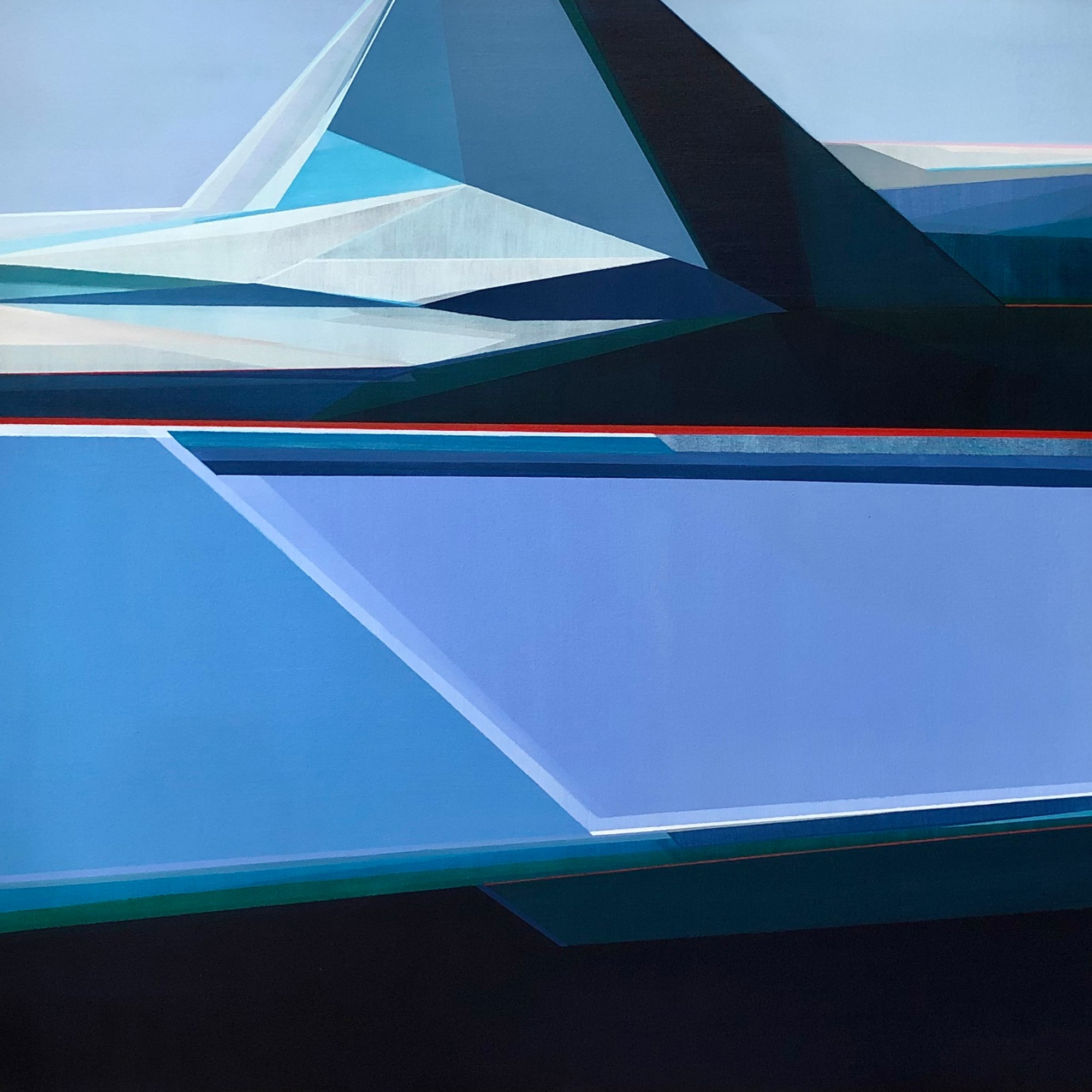
Sunrise Mountain: Angular Aesthetics

Sunrise Mountain geometric abstract painting by Shilo Ratner

Sunrise Mountain (pictured above) remains one of Shilo's most refreshing pieces in the sheer splendor of angular aesthetics. Containing subtle variations of blue which range from Prussian, cerulean, and turquoise, the jagged mountain spills onto the flat body of water with intricate shapes of reflections of highlights and shadows in the form of stretched triangles and rectangles of varying tones. The sunlight becomes portrayed through a minimalist approach of just three stripes of angular color in the low foreground as if to indicate the dew of dawn.

A Poetic Painter

Shilo Ratner can be described as a poetic painter who offers a cool, polished approach to distortions in painting through angular beauty and grace. Much like a ballet performance, the paintings delicately, and with great balance, mesmerize the audience through carefully crafted composure with intense focus on the horizon line and purification of light and shadow.

Shilo builds upon contemporary painting principles through elongated perspectives which convey a sense of harmony and inner peace distracting from the confines of stress-inducing reality. She offers an escape into a realm which reinterprets physical existence with flares of diamond-shaped form, highlights, and shade.

Mountains by Water geometric abstract painting by Shilo Ratner Up North geometric abstract mountain painting by Shilo Ratner Mountain Air geometric abstract painting by Shilo Ratner

The Significance of Curator Recognition

Curator reviews and Best in Show awards carry significant weight in the art world. They represent professional validation from experts who view thousands of artworks and select only the most compelling pieces for recognition.

For collectors, curator-selected artwork represents not just aesthetic value but also cultural significance and investment potential. It's a mark of quality and relevance in the contemporary art landscape.

Explore Geometric Abstract Paintings

If you're drawn to geometric abstract art that explores landscape, light, and form through angular beauty and precision, I invite you to explore my collection. Each piece is created with the same attention to composition, color, and emotional resonance that curator Michael Hanna describes in his review.

View Geometric Abstract Art Collection

Interested in learning more about the work or discussing a commission? Feel free to reach out. I'm always happy to talk about the paintings and the ideas behind them.


Follow along on Instagram for studio updates and exhibition announcements.

Read Also

See all Shilo Ratner Art Studio & Exhibition Updates
Three geometric abstract mountain paintings by Shilo Ratner, featuring bold color and structured form
The Psychology of Color in Art
The Psychology of Color in Art I've been thinking a lot lately about how color functions almost independently from subject matter in painting. Long before we recognize an object, a horizon line, or a figure, we react emotionally to color relationships. That reaction is immediate and psychological. It's one of the reasons I continue returning to artists like Josef Albers and Pierre Bonnard. Their work reminds me that color itself can become the structure, emotion, and atmosphere of a painting. Albers approached color almost scientifically. His studies explored how colors change depending on what surrounds them, how one color can appear completely different when placed beside another. A muted gray can suddenly become luminous. A soft blue can feel cold against one tone and electric against another. What fascinates me about Albers is that he proved color is never fixed. It's relational. Psychological. Unstable in the most beautiful way. Bonnard approached color differently, but with just as much intensity. His paintings dissolve observation into atmosphere. The color combinations are often unexpected: acidic yellows against lavender shadows, saturated oranges beside pale violets, strange greens woven into interiors and skin tones. Yet somehow the paintings feel emotionally true. That balance between dissonance and harmony is something I think about constantly in my own work. When I'm painting water, marshes, or coastal spaces, I'm rarely interested in reproducing literal color. I'm more interested in creating a sensation through color interaction. Sometimes that means pushing warmth into areas that should technically feel cool, or allowing deep ultramarines to sit beside softened blush tones because the tension between those colors creates emotional movement. I think that's where painting becomes less about documentation and more about perception. Certain color combinations can create stillness while others create vibration. A muted blue-gray beside a sharp coral can suddenly make a painting feel alive. Soft tonal shifts can create quietness and distance. Saturation can create physical energy. I notice this especially when layering paint. Often the most important decisions happen when I stop thinking about "local color" entirely and start thinking about temperature, contrast, memory, and emotional weight. That's something Bonnard understood deeply. His paintings were never really about interiors or landscapes alone. They were about light filtered through memory and emotion. The color carried the psychological experience of the space. I think collectors respond to this intuitively, even if they don't consciously analyze why. People often tell me a painting feels calming, expansive, nostalgic, or atmospheric before they ever discuss composition. The emotional response happens first. And honestly, I think that's the power of painting itself. Color bypasses language. It reaches us in a place that feels instinctive, emotional, and almost impossible to fully explain. Related Reading If this resonates, these posts go deeper into the ideas behind the work: How Josef Albers Shaped the Way I See Color — the direct influence of Albers' relational color theory on my geometric practice. Pierre Bonnard and the Color That Holds — how a trip to Paris deepened my understanding of color as emotional memory. Raimonds Staprans: Saturated Color, Presence, and Lasting Impact — another painter who uses color as pure psychological force. Pieces That Connect These works came directly out of the ideas above, color as structure, tension as atmosphere: Sail Away, 36×36 — ultramarine and warm coral in direct tension, the color does the emotional work before the subject registers. Beach, 30×30 — soft tonal shifts across a geometric plane, stillness created through temperature rather than subject. Harbor, 30×40 — deep blues and muted neutrals layered to create distance and quiet, the kind of atmospheric weight Bonnard understood. Bring This Into Your Space If you've ever felt drawn to a painting before you could explain why, that's color doing exactly what it's meant to do. Explore the collection to find the piece that holds that feeling for you, or inquire about a custom commission if you have a specific palette or feeling in mind. Explore the Collection →
Shilo Ratner working in her studio on a geometric abstract painting
What Makes a Painting Feel Alive?
There's a moment in the studio when a painting stops needing you. Shilo Ratner reflects on what makes a painting feel emotionally alive, from intuitive color choices and visible layers to the tension between imperfection and completion.
Beach 30x30 original geometric abstract painting by Shilo Ratner on white wall
One Painting, Fully Explained: Beach
Most paintings get a title, a price, and a few sentences. This one takes a closer look. Beach is a 30 × 30 geometric abstract painting built from the logic of the shoreline, behavior, not appearance. This is a complete breakdown: where it started, how it was built, what changed, and what most people miss. See Beach in the collection → The Initial Idea The starting point wasn't a visual. It was a behavior. I kept returning to the way water moves at the shoreline, not the look of it, but the logic. The tide doesn't repeat exactly. Each wave recedes at a slightly different angle, leaves a slightly different edge, pulls back with slightly different force. There's a system operating, but it never produces the same result twice. A system needs enough repetition to be legible, but enough variation to stay alive. That tension between system and variation is what I wanted to build into a painting. Not a picture of the beach. A painting that works the way the beach works. Building the System The canvas is square, which matters. A square doesn't have a natural direction. It doesn't push the eye left to right or top to bottom the way a landscape format does. That neutrality was useful here, because the movement had to come entirely from the forms themselves, not from the shape of the support. The composition is built from horizontal bands that shift, compress, and interrupt each other. They function as tidal layers: each one moving at a different rate, overlapping without merging. The eye follows the edges rather than any single focal point. There's no center of gravity. The painting holds attention by distributing it. That relationship between rhythm and structure is something I explored more directly in Ebb and Flow Abstract Painting: When Surrender Becomes Creation. I also made a deliberate decision to keep the forms hard-edged. Soft edges would read as atmospheric, impressionistic, wave-like in a literal sense. Hard edges force the geometry to carry the movement instead. The result feels more like a diagram of the coast than a depiction of it. Color Logic The palette is blue and neutral, but the neutrals are doing most of the structural work. A range of warm and cool off-whites sits alongside the blues, and the temperature shifts between them create a subtle spatial push and pull. Warmer neutrals advance slightly. Cooler ones recede. That movement is quiet, but it's what gives the painting depth without relying on illusionistic perspective. The same principle is at work in How Josef Albers Shaped the Way I See Color. The blues are controlled rather than expressive. Some lean toward slate, others toward a washed cerulean, others toward near-gray. Each one is chosen for its relationship to the forms around it, not for emotional effect on its own. The emotion comes from the whole, not any single color. I also kept the value range relatively compressed. High contrast would have created drama. I was after something steadier, calm, but still in motion. The result is a kind of unsettled calm, like watching the tide without needing it to resolve. What Changed Along the Way The early version had more forms, more bands, more interruptions, more variation in width. It was busier, and that busyness worked against the system. I simplified. Removed two horizontal elements entirely. Widened two of the remaining bands so the rhythm slowed down. The painting became quieter, and paradoxically more active, because the eye had room to move between the forms rather than being crowded by them. The frame color also changed. The original frame was a cooler white that competed with the lightest tones in the painting. I switched to a warmer wood finish that separates cleanly from the canvas without pulling attention. What Viewers Don't Notice The edges of the forms are not perfectly parallel. This is intentional. If every horizontal band were exactly parallel, the painting would feel mechanical, static, like a striped field rather than a system in motion. The slight deviations, a degree or two at most, create the sense that the forms are shifting relative to each other. It reads as movement without being obvious about it. Most people also don't notice how few colors are actually in the painting. From a distance it reads as rich and varied. Up close, the palette is spare. That compression is part of the discipline: getting a lot of visual information from a small number of decisions. The bottom edge of the composition is slightly heavier than the top. The forms there are wider, the values slightly darker. It grounds the painting without making it feel weighted down. It's the visual equivalent of the shoreline itself, the place where everything settles before the next wave comes through. If that kind of movement resonates with you, Beach is available as a framed original, 30 × 30 inches, ready to hang. If you'd like to see it in your space before deciding, I'm happy to help with that. You can also browse the full coastal paintings collection for related works. View Beach →  |  Questions: shiloratner@gmail.com
Buy original art with payment plans - flexible installment payments available
Making Art More Accessible: A New Way to Collect Original Paintings
I still remember the first painting I bought for myself. I was in my early 20s, standing in a small gallery, going back and forth on whether I should do it. It felt like a big deal, because it was. I was excited, but also nervous about spending the money. I didn't fully understand yet what it meant to live with a piece of original art, only that I wanted my apartment to feel more like mine, more considered, more complete.
Geometric abstract painting displayed on a white wall, showing structured form and color in an interior setting- Artist Shilo Ratner
The First Mark Matters More Than You Think
Early decisions act as constraints, but not in a restrictive way. They create direction. A horizon line placed slightly higher or lower shifts the entire spatial experience. A compressed shape changes how the surrounding space breathes. A color introduced too early can either anchor the work or flatten it. These choices don't just sit on the surface. They organize everything that follows. The painting begins to build from that first condition.
Original geometric abstract painting by Shilo Ratner hanging in a home interior
What Happens After You Buy a Painting?
Most conversations about art end at the point of purchase. But what happens after a painting comes home? That's where the real story begins, and where the value of original art truly reveals itself.
Geometric abstract art collection guide - tips for art collectors by Shilo Ratner
How to Collect Geometric Abstract Art: The Complete Guide | Shilo Ratner
As an artist whose work has been exhibited in museums and represented by respected galleries, I’ve seen how a painting can transform a space, spark conversation, and even become an investment. First-time collectors often wonder whether a piece will “fit” their home or lifestyle, but the truth is: trust your instincts.
Theophilus Brown monograph, Bay Area Figurative Movement, from Shilo Ratner's personal collection
Tea with Theophilus Brown
A reflection on meeting Theophilus Brown after being selected for the Art Space 712 portrait exhibition in San Francisco.
Geometric Painter Shilo Ratner artist interview with Embrace Creatives
Original Geometric Art: Interview with Shilo Ratner
New Haven-based geometric abstract artist Shilo Ratner discusses her creative process, artistic influences including Hilma af Klint and Agnes Martin, and the philosophy behind her contemplative geometric paintings in this Embrace Creatives interview.
Gallery view of geometric abstract landscape paintings by Shilo Ratner
The Influence of Nature on My Landscape Paintings
Nature has an incredible way of grounding us — and that influence is central to my landscape-inspired artwork. Rather than painting literal scenes, my work abstracts natural forms into simplified shapes and layered compositions. 
Traces of Stillness — 6x6 inch original landscape collage series by Shilo Ratner, layered paper works on paper
Traces of Stillness: New Landscape Collage Series
Traces of Stillness is a contemplative 6×6 inch collage series by Shilo Ratner exploring quiet mountain landscapes through minimal form, layered paper, and subtle geometry. Original works on paper available now.
Pockets Filled With Hope 5x10ft geometric abstract painting installation at Southern Connecticut State University
Pockets Filled With Hope SCSU!
Large-scale public art installation: Pockets Filled With Hope, a 5x10ft geometric abstract painting by Shilo Ratner, installed at Southern Connecticut State University School of Business.